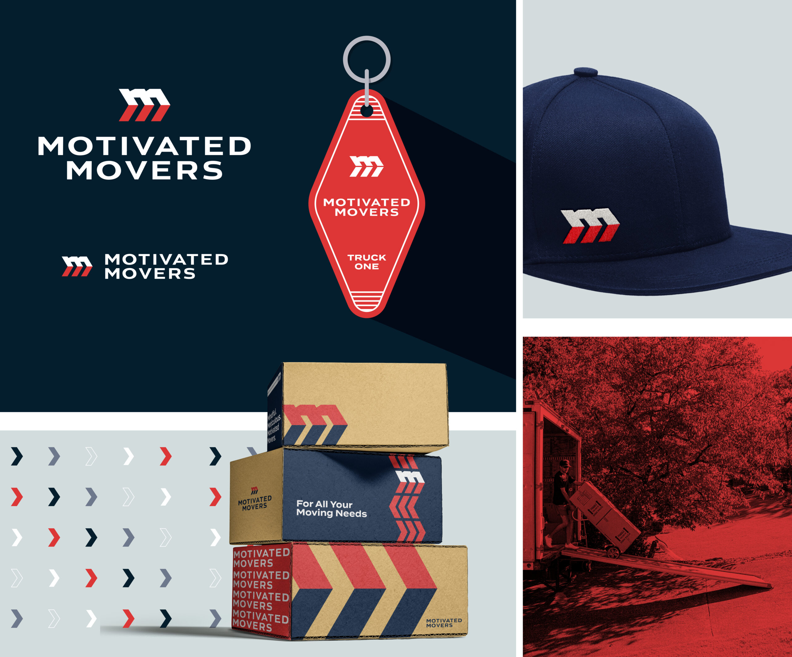
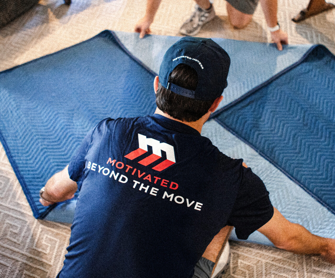
Motivated Movers
- Brand Identity
- Photography
Motivation Made Visual
Exploring what it truly means to be motivated led us to a design system that embodies motion, momentum, and precision. The arrows forming the M icon give the mark its sense of speed and direction, symbolizing how the company helps customers move confidently into their next chapter. Every detail was built to convey energy and reliability: hallmarks of a brand that specializes in getting people (and their stuff) from point A to point B.
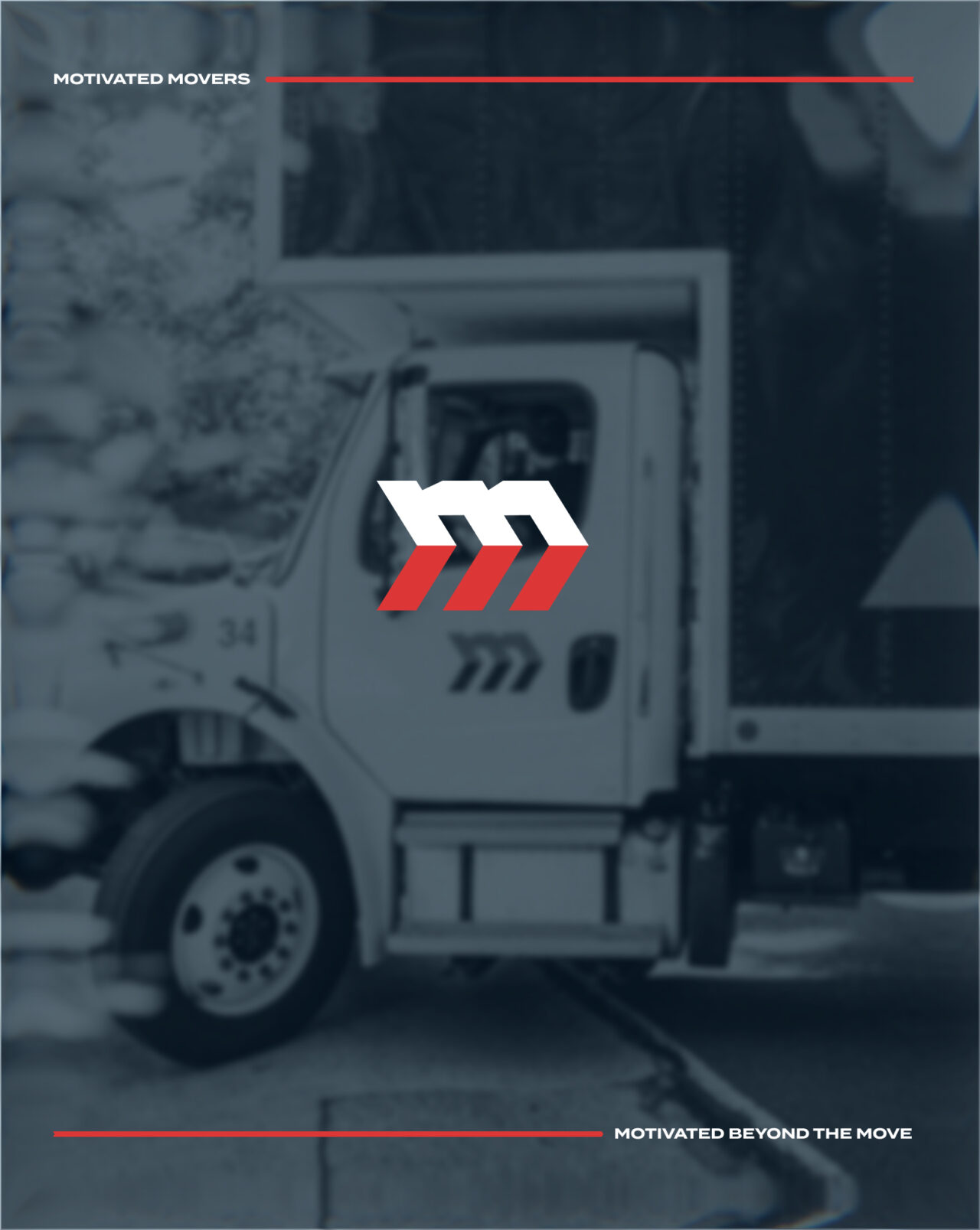
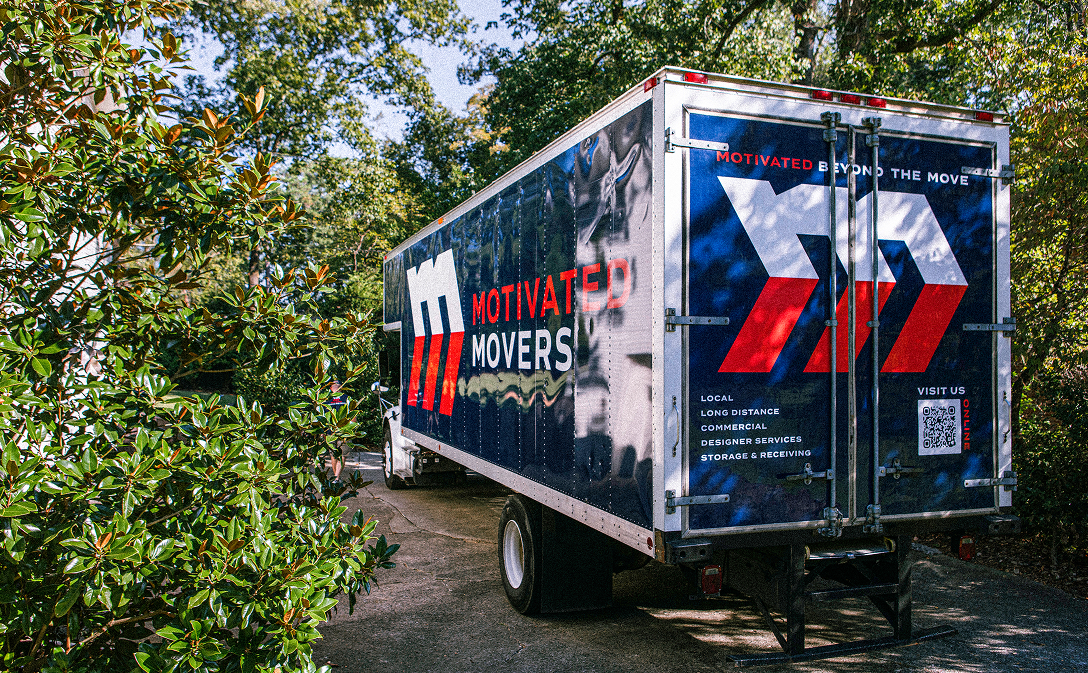
A punchy red carried over from the previous identity as a confident highlight color, while the graphic system is built around the arrow motif. The result is a cohesive visual language that feels sharp, energetic, and on the move – just like the company itself. From the logo to the motion-inspired patterns and photography direction, all the elements reinforce a sense of progress and professionalism that keeps Motivated Movers pointed forward.